styled-components v5.0 基本用法
本文大部分内容翻译或总结自官方文档,理解可能不到位,欢迎指出。
安装
npm install --save styled-components
使用
import styled from 'styled-components';
给HTML标签或组件加样式,或者继承样式
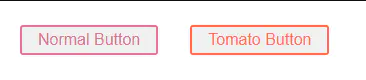
- styled-components可以给HTML标签或者用户自定义组件加样式,加完以后变成一个组件的形式,首字母必须大写。
- 给标签加样式可以
styled.button也可以styled("button"),一个效果。 - 加了一次再加一次就是继承(extend)的效果
// 给标签加样式
const Button = styled.button`
  color: palevioletred;
  font-size: 1em;
  margin: 1em;
  padding: 0.25em 1em;
  border: 2px solid palevioletred;
  border-radius: 3px;
`;

// 给组件加样式,覆盖原来的部分样式
const TomatoButton = styled(Button)`
  color: tomato;
  border-color: tomato;
`;

render(){
  return (
    <div>
      <Button>Normal Button</Button>
      <TomatoButton>Tomato Button</TomatoButton>
    </div>
)};
选择器、伪选择器、伪元素和嵌套
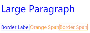
- 通过选择器控制组件子元素样式
const Thing = styled.div`
  color: blue;  // 给div的样式

  // 给div子元素里面class为something的组件的样式
  .something {
    border: 1px solid;
  }

  // 给div子元素里面span们的样式
  span {
    color: orange;
  }

  // 给div子元素里面id为para的组件的样式
  #para {
    font-size: xx-large;
  }
`;
  ...
  render() {
      return (
        <Thing>
          <p id="para">Large Paragraph</p>
          <label className="something">Border Label</label>
          <span>Orange Span
            <span className="something">Border Span</span>
          </span>
        </Thing>
      );
  }
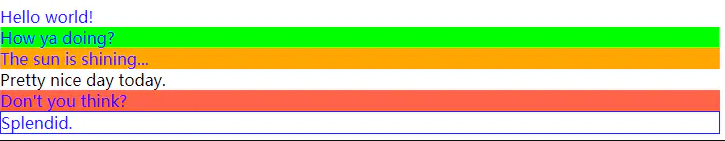
- 伪元素、伪选择器和嵌套使用
其中&符号在里面代表组件自己
// 关于attrs添加属性,下面一节讲
const Thing = styled.div.attrs((/* props */) => ({ tabIndex: 0 }))`
  color: blue;

  &:hover {
    color: red; // 鼠标悬浮在<Thing> 上面
  }

  & ~ & {
    background: tomato; // <Thing> 的同级<Thing>组件,不一定是相邻的
  }

  & + & {
    background: lime; // <Thing> 的下一个 <Thing>组件
  }

  &.something {
    background: orange; // 有something class的<Thing>组件,注意跟上面一节没&的区分
  }
  .something-else & {
    border: 1px solid; // 位于其他有".something-else"类标记的组件里面的<Thing>组件
  }
`
render(
  <React.Fragment>
    <Thing>Hello world!</Thing>
    <Thing>How ya doing?</Thing>
    <Thing className="something">The sun is shining...</Thing>
    <div>Pretty nice day today.</div>
    <Thing>Don't you think?</Thing>
    <div className="something-else">
      <Thing>Splendid.</Thing>
    </div>
  </React.Fragment>
)
- 跟全局冲突时候,可用&&提升优先级
const Thing = styled.div`
  && {
    color: blue;
  }
`
const GlobalStyle = createGlobalStyle`
  div${Thing} {
    color: red;
  }
`
render(
  <React.Fragment>
    <GlobalStyle />
    <Thing>
      I'm blue, da ba dee da ba daa
    </Thing>
  </React.Fragment>
)
此处会渲染蓝色字体,懒得截图了
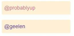
传递组件props属性
- 对于一个被包装的普通HTML标签,styled-components会传递所有HTML attribute给DOM
- 对于一个被包装的React组件,styled-components会传递所有props属性
- 在标签模板字符串中使用${props=>(props.someProps)}的形式获得props属性
- 可以通过defaultProps设置默认props
// Create an Input component that'll render an <input> tag with some styles
const Input = styled.input`
  padding: 0.5em;
  margin: 0.5em;
  color: ${props => props.inputColor || "palevioletred"};
  background: papayawhip;
  border: none;
  border-radius: 3px;
`;

// 通过defaultProps设置默认属性,效果跟上面||形式提供默认值一致
Input.defaultProps = {
  inputColor: "palevioletred",
}

// Render a styled text input with the standard input color, and one with a custom input color
render(
  <div>
    <Input defaultValue="@probablyup" type="text" />
    <Input defaultValue="@geelen" type="text"
      inputColor="rebeccapurple" />
  </div>
);
- 可以使用attrs构造器给组件或HTML标签添加额外的属性。可以直接添加静态属性,也可以传递一个函数,返回动态属性
// 通过attrs直接传递props
const Input0 = styled.input.attrs({ type: 'password' })``;
// 通过attrs函数式参数传递props
const Input = styled.input.attrs(props => ({
// 定义静态属性,使所有Input都是密码输入框
type: "password",
// 也可以定义动态属性
size: props.size || "1em",
}))`
color: palevioletred;
font-size: 1em;
border: 2px solid palevioletred;
border-radius: 3px;
/* 通过计算获得动态属性 */
margin: ${props => props.size};
padding: ${props => props.size};
`;
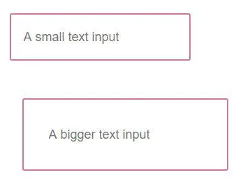
render(
<div>
<Input placeholder="A small text input" />
<br />
<Input placeholder="A bigger text input" size="2em" />
</div>
);
Theme主题
- styled-components利用context API实现theme自上而下的传递
- 通过引入<ThemeProvider>包装组件实现theme属性的传递
- theme属性可以是对象也可以是函数(extendTheme=>newTheme形式)
- 利用高阶组件withTheme使没有被styled-components包装过组件也能获取theme属性
- 直接给组件提供theme属性可以覆盖ThemeProvider的默认theme
import React from 'react';
import styled, {ThemeProvider, withTheme} from 'styled-components';
const Button = styled.button`
color: ${props=>props.theme.fc};
border: 2px solid ${props=>props.theme.fc};
background-color: ${props=>props.theme.bc};
font-size: 1em;
margin: 1em;
padding: 0.25em 1em;
border-radius: 3px;
`;
Button.defaultProps = {
theme: {
fc: 'palevioletred',
bc: 'white'
}
};
// 普通对象作为theme属性
const theme1 = {
fc: 'mediumseagreen',
bc: 'white',
}
// 函数作为theme属性,函数参数为上一级theme
const theme2 = ({fc, bc}) => ({
fc: bc,
bc: fc,
})
// 直接传theme给组件,覆盖继承的theme
const theme3 = {
fc: 'royalblue',
bc: 'lightsmoke',
}
// 普通React组件无法获得theme属性
const MyCmp = (props) => <div>ForeColor: {props.theme ? props.theme.fc : 'unknown'}</div>;
// 通过withTheme高阶组件获得theme属性
const MyCmpWithTheme = withTheme(MyCmp);
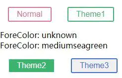
export default class App extends React.Component{
render(){
return (
<div>
<Button>Normal</Button>
<ThemeProvider theme={theme1}>
<Button>Theme1</Button>
<MyCmp />
<MyCmpWithTheme />
<ThemeProvider theme={theme2}>
<Button>Theme2</Button>
<Button theme={theme3}>Theme3</Button>
</ThemeProvider>
</ThemeProvider>
</div>
)
}
};
- 打赏
请选择打赏方式


- 微信
- 支付宝

